
In today’s digital world, smartphones have become the primary way people browse the internet. Whether users are shopping online, searching for services, reading blogs, or contacting businesses, most of them are doing it from mobile devices. This is why having a mobile-friendly website is no longer optional — it’s essential.
A website that works perfectly on mobile devices improves user experience, increases engagement, boosts SEO rankings, and helps businesses generate more leads and sales.
What is a mobile-friendly website?
A mobile-friendly website is designed to automatically adjust and function smoothly on smartphones and tablets. It ensures:
- Fast loading speed
- Easy navigation
- Readable text without zooming
- Properly sized images and buttons
- Smooth browsing experience across all devices
When a website is optimized for mobile users, visitors can access information quickly and interact with the site effortlessly.
Mobile Usage is Growing Rapidly.
More than half of global web traffic now comes from mobile devices. People prefer browsing on their phones because it is convenient, fast, and accessible anywhere.
Businesses that still rely on outdated desktop-only websites risk losing a huge number of potential customers.

Mobile-Friendly Websites Improve SEO Rankings
Search engines like Google prioritize mobile-friendly websites in search results. Google uses mobile-first indexing, meaning it primarily evaluates the mobile version of your website for ranking purposes.
Benefits include:
- Better Google rankings
- Increased organic traffic
- Lower bounce rates
- Improved visibility in local searches
A non-responsive website can negatively affect your SEO performance and reduce online visibility.
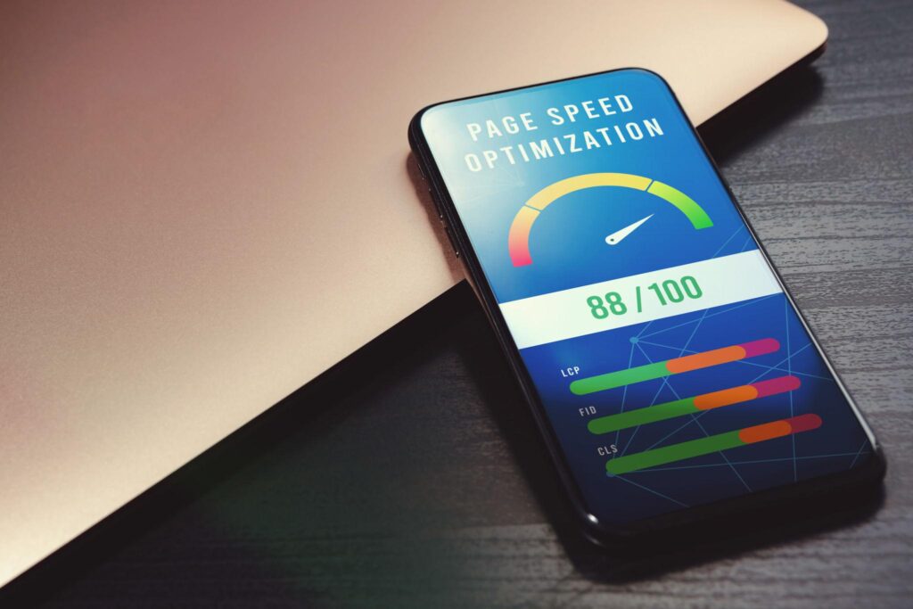
Faster Websites Mean Better User Experience
Mobile users expect websites to load quickly. If your website takes too long to load, visitors are likely to leave within seconds.
A mobile-optimized website offers:
- Faster loading times
- Smooth navigation
- Better readability
- Easy interaction
This creates a positive experience that encourages users to stay longer and explore your services.
Higher Conversion Rates for Businesses
A professional mobile-friendly website can significantly improve conversions.
When users can easily:
- Browse products or services
- Fill out contact forms
- Make purchases
- Call your business directly
they are more likely to become customers.
A responsive design builds trust and gives your business a more professional appearance.
Mobile Shopping is Dominating E-Commerce
Online shopping through smartphones continues to grow every year. Customers now prefer browsing and purchasing directly from mobile devices.
If your website is difficult to use on mobile:
- Users may abandon their carts
- Sales opportunities may be lost
- Competitors with better mobile experiences may gain your customers
A mobile-responsive website ensures seamless shopping experiences and better customer satisfaction.

Better Engagement Across All Devices
Modern users switch between devices throughout the day. They may:
- Discover your website on mobile
- Continue browsing on tablet
- Complete actions on desktop
Responsive websites provide a consistent experience across all screen sizes, improving engagement and brand credibility.
🔐 Mobile-Friendly Websites Build Trust
A poorly optimized website can appear outdated and unprofessional. Visitors may question the credibility of your business if:
- Text overlaps
- Buttons don’t work properly
- Pages load slowly
- Navigation is difficult
A clean and responsive website helps establish trust and encourages visitors to interact with your business confidently.
Mobile Optimization Helps Local Businesses
Many users search for businesses “near me” directly from their smartphones.
Mobile-friendly websites improve:
- Local SEO visibility
- Google Maps rankings
- Customer inquiries
- Walk-in traffic
For local businesses, mobile optimization can directly impact revenue and customer growth.

Key Features of a Mobile-Friendly Website
A successful mobile-responsive website should include:
- Responsive design
- Fast loading speed
- Mobile-friendly navigation
- Clickable buttons
- Optimized images
- Secure browsing (HTTPS)
- SEO-friendly structure
Final Thoughts
Mobile-friendly websites matter more than ever because modern users expect speed, convenience, and seamless browsing experiences. Businesses that invest in responsive web design gain:
- Better SEO rankings
- More traffic
- Higher engagement
- Increased conversions
- Stronger brand credibility
In today’s competitive digital landscape, a mobile-optimized website is not just an advantage — it is a necessity for business growth.
Need a Mobile-Friendly Website?
At Queue Index, we create responsive, modern, and SEO-friendly websites designed to help businesses grow online.
📩 Email: [email protected]